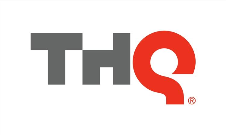
THQ kicks off their "Gamer's Week" event and reveals their new logo. The Q emphasizes "Quality!"
posted:
1/12/2011 5:14:00 AM
More On:
Taking the stage at THQ's "Gamer's Week," Vice President of Core Games; Danny Bilson unveiled the new logo for Toy Head-Quarters. Taking the opportunity to stress the quality of their upcoming games, hence the red Q. The new logo ditches the "fast" look that was previously used. Personally, I like it. Click on through to view the press release and check back with us in a few days for hands-on previews of the titles on display at the event.


In an official unveiling ceremony at its New York Gamers Event, THQ today announced a new corporate logo, reflecting the company’s commitment to a new strategic and creative vision with an enhanced visual identity.
"Our new logo epitomizes the change, innovation and creative growth that are the cornerstones of the new THQ," said Brian Farrell, THQ President and CEO. "By developing triple-A, innovative, original intellectual properties, attracting the top talent in the industry, and placing that talent first, THQ continues to redefine itself. This new logo seeks to capture that change and make it tangible."
"Over the past few years the gaming industry has seen an unprecedented period of innovation," Farrell said. "You can see it in the deep, rich storylines, in the expansion of social and mobile gaming, and in the introduction of new technologies that enhance the gaming experience. THQ is proving its commitment to deliver the best experience to gamers through internally developed original intellectual properties (Homefront™ and uDraw™), creative partnerships, (Guillermo del Toro and Tomonobu Itagaki) and new talent acquisitions (Patrice Désilets), in order to solidify its position as a flagship publisher of extraordinary interactive entertainment."
The new logo will be rolled out over the next few months and will begin to appear on THQ’s upcoming product releases starting in February.