Moonshades
Moonshades doesn’t provide you with much up front. A small bit of lore about the world you’re in, and something about monsters appearing and driving the humans underground to stay safe. Perhaps that’s because it originated as a mobile game, not that there’s anything wrong with that. It’s hard to interest anyone in reading pages and pages of lore. We’ve evolved as a people since Morrowind was released in 2002. You choose a picture avatar for your two characters, and boom, you’re off. There are tutorials for you to follow, but the advice they give doesn’t give you much to work from. But I found that to be ok. I’m in a dungeon, I’m delving, I get it. Don’t die, find treasure. I don’t need much else.
While I don’t need much exposition for this game, I do need some direction on what I should be doing or, at the very least, where I should be heading. There is zero feedback on that front, or how to go about doing much of anything. I felt as though I was walking around aimlessly from one floor to the next. Sometimes I would take a set of stairs and it would lead me into another newly named space, unsure if this was the direction I was supposed to head or not. Finding a map is easy enough, but again, if there is no direction to head to then all it does is show me how to exit the current floor into another one. The lack of direction makes it impossible to know if I’m doing the right thing or not. Am I heading in the right direction? Who knows. The small bit of story given at the beginning tells me to search for three missing artifacts.

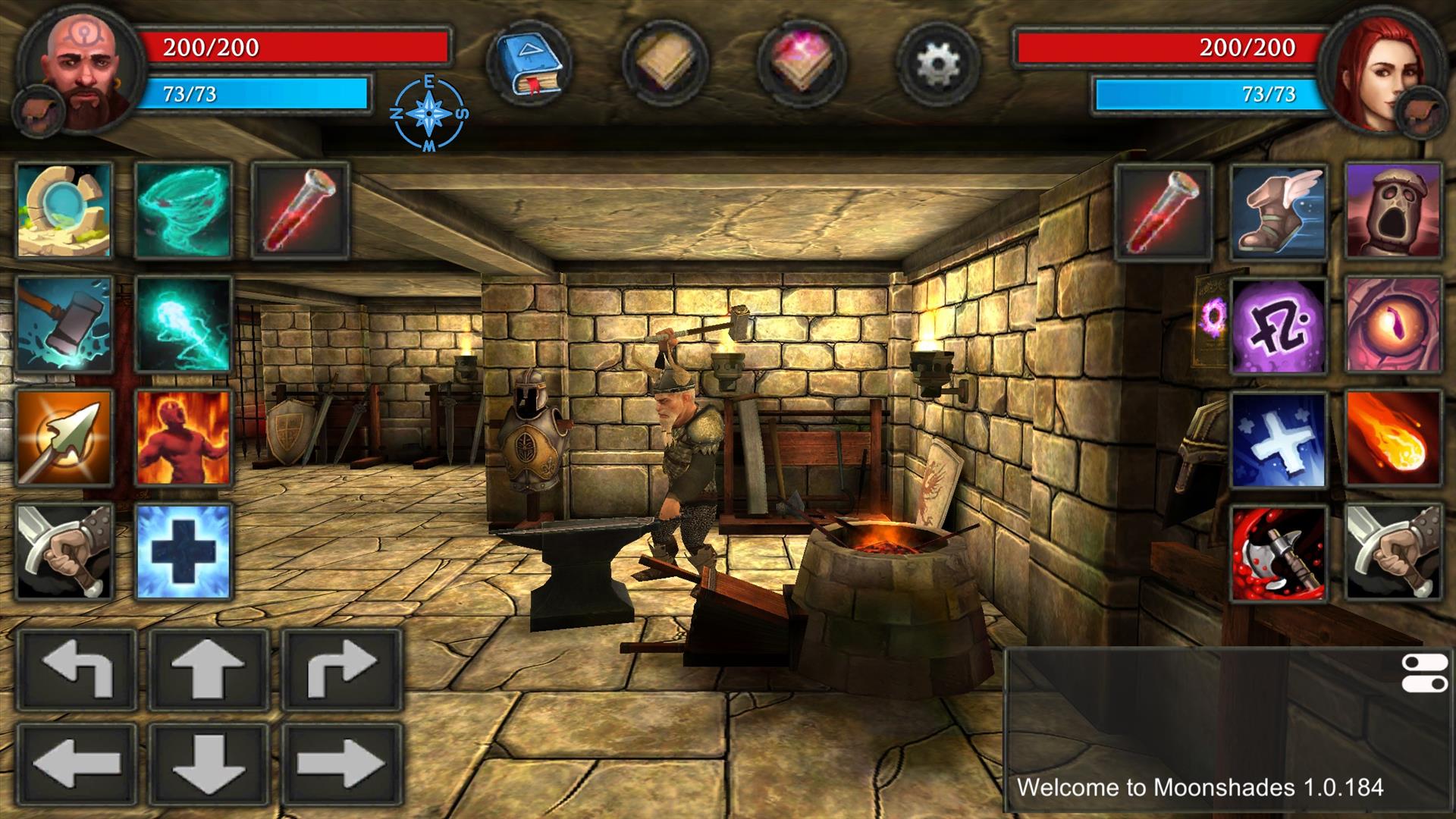
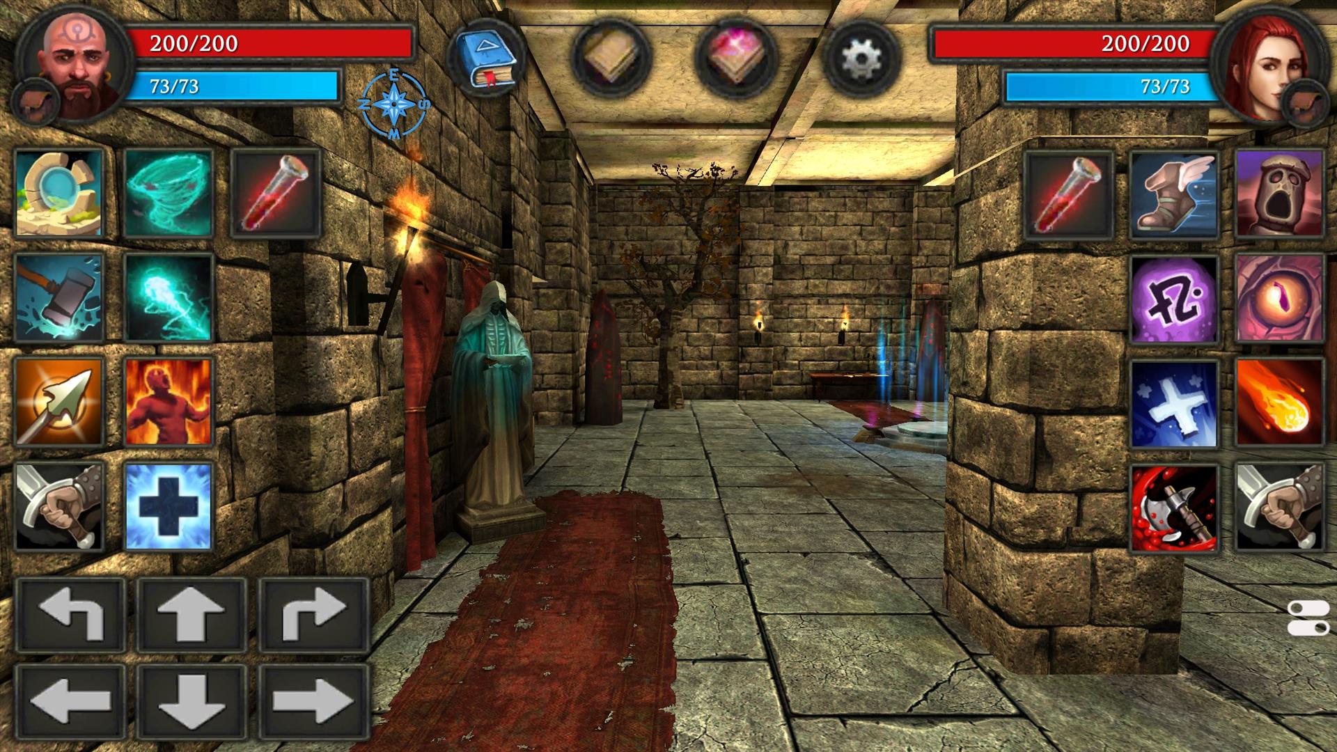
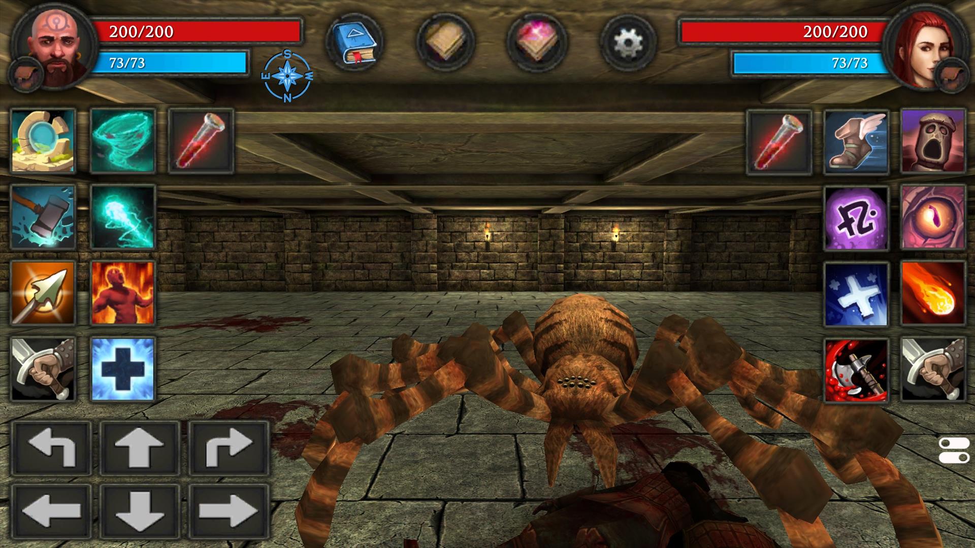
Moonshades is played in a first-person viewpoint, even though you are controlling two characters at the same time. Because you have control of two characters at once, all of the items, powers, or specials they can use show up on your screen. These take the form of squares that take up the entire right and left half of the screen. At the top of the screen are your health and mana bars, along with a compass and four other menu based buttons. On the bottom right is a chat log to show you your recent past events. When all is said and done you find yourself playing the game with half of the screen, the other half being menus and moves. Simply put, there is too much information being put on to the screen. I can’t help but think most of this could have been completely avoided by putting a few menus behind the start button, or better use of button mapping moves. Again, this harkens back to Moonshades' mobile roots, where you have to put all of this information on the screen. Playing this game on the Nintendo Switch, though, makes it just annoying.
The controls in Moonshades are simply terrible. It is clear that the game was originally designed with a smart phone in mind, and it shows. While I do not like that a lot of screen space is devoted to having so many things on screen it makes sense why it would be done for a phone game, there’s not much choice. While everything you can do in the game can be done with the touch screen, which is nice at times, you can also play the game completely with a controller.
Movement is handled in one of two ways. Either the touch screen, which has your forward, backwards, left right, and turn buttons mapped onto your screen. Regardless of if you use the touch screen controls those buttons are there, and they stay there. I found using the D-pad on the controller to move to be much easier, it also allowed for strafing, which was key to taking on monsters. As I said, you do not have a lot of choices in movement, forward, backward, strafe left or right, and turn. The world you are in is not voxel, but your movement is done on a grid, while creatures you come into contact with move however they want, not following the grid-based movement you have to use.

All of the moves you can make—casting spells, slashing with your sword, drinking a health potion—can all be done by pressing the buttons on the screen. But if you are using a controller, with the exception of one move for each character you can have mapped to a trigger, the game basically pauses itself while you set which additional move to use next. This basically forces you to do one of two things. The first is playing the game in handheld mode, without a controller, which is the best way to play this game. Or trudge through with a controller, slowly. I also found the button mapping for the controller to be the most confusing layout and use of the buttons, joysticks, and triggers I have ever seen in a video game. Every time I sat down to play a session it was like I had amnesia from the previous time I played. I had forgotten the key bindings all over again because they make no sense to me. Which buttons turn, which ones just strafe the characters, where the health potion button is located (you push in on the thumbsticks). To open a certain menu I had to push a joystick the correct direction, having four different menus made it impossible to recall which one led me to the menu I was currently looking for. I wanted to play mostly on my TV so I suffered through it with a controller.
Movement also hurts combat. Once I was in the heat of combat I would forget to use the correct button and found myself turning to face a wall and then swinging my sword, hitting no one. I eventually got better at it. Another struggle I encountered was how slow combat felt when playing with a controller vs playing with just the touch screen controls. With the controller besides being able to swing my weapon I was forced to pause the game while I chose which moves to cast. This made every fight last a little longer as I had to click the spells to cast for each character separately. While using the touch controls I could simply touch the spell and use it, but again, I disliked moving with the touch controls so I was forced into using the controller.

Outside of the controls and screen space, most other aspects of the game were overall enjoyable. Leveling up did not feel like a drag at all, perhaps even too easy, as I felt overpowered pretty quickly in the game. There were always new spells or skills that were just unlocked. A handful of builds to play the style I wanted to was also nice. The look of Moonshades was old school in a good way. I felt like I was playing a first-person game made a few years after the original Doom. Exploring what seems like an endless dungeon doesn’t feel boring at first either. While it might seem endless it never looks the same for too long. The only time I grew tired of it was when I had no idea where to go, or was forced to backtrack and clear out the monsters once again. I also became addicted to the dice mini game that can be found in the main town.
Moonshades has a nostalgic feel to it. It might not completely scratch the itch of playing old school Dungeons and Dragons, but it comes close. I had fun searching dungeon after dungeon, even though I was never really told why. Controls made everything harder. Having to choose the lesser of two evils, play the game docked for the bigger screen, slower combat, and confusing controls, instead of having to squint to see what’s going on in handheld mode. I found the controller to be the better of the two. I was able to get over the controls eventually and found myself having fun exploring and fighting monsters, but I’m not sure everyone could get over the game's shaky foundations.
Rating: 6.5 Below Average
* The product in this article was sent to us by the developer/company.

About Author
I'm pulled towards anything that isn't driving or sports related; having said that, I love a good kart racer. I Can't get enough RPGs, and indies are always worth a look to me. The only other subject I pay any attention to is the NFL (go Colts!).
While writing about games is my favorite hobby, talking is a close second. That's why I podcast with my wife Tessa (it's called Tessa and Elliot Argue).
View Profile


