SOLAS 128
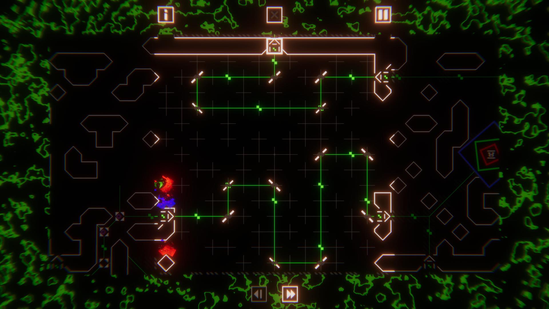
It's easy to dismiss Solas 128 on first glance. It's a puzzle game that, in still shots, can only boast of a rather basic, albeit colorful, interface. The trick about Solas is that you have to actually see it in motion to recognize its brilliance.
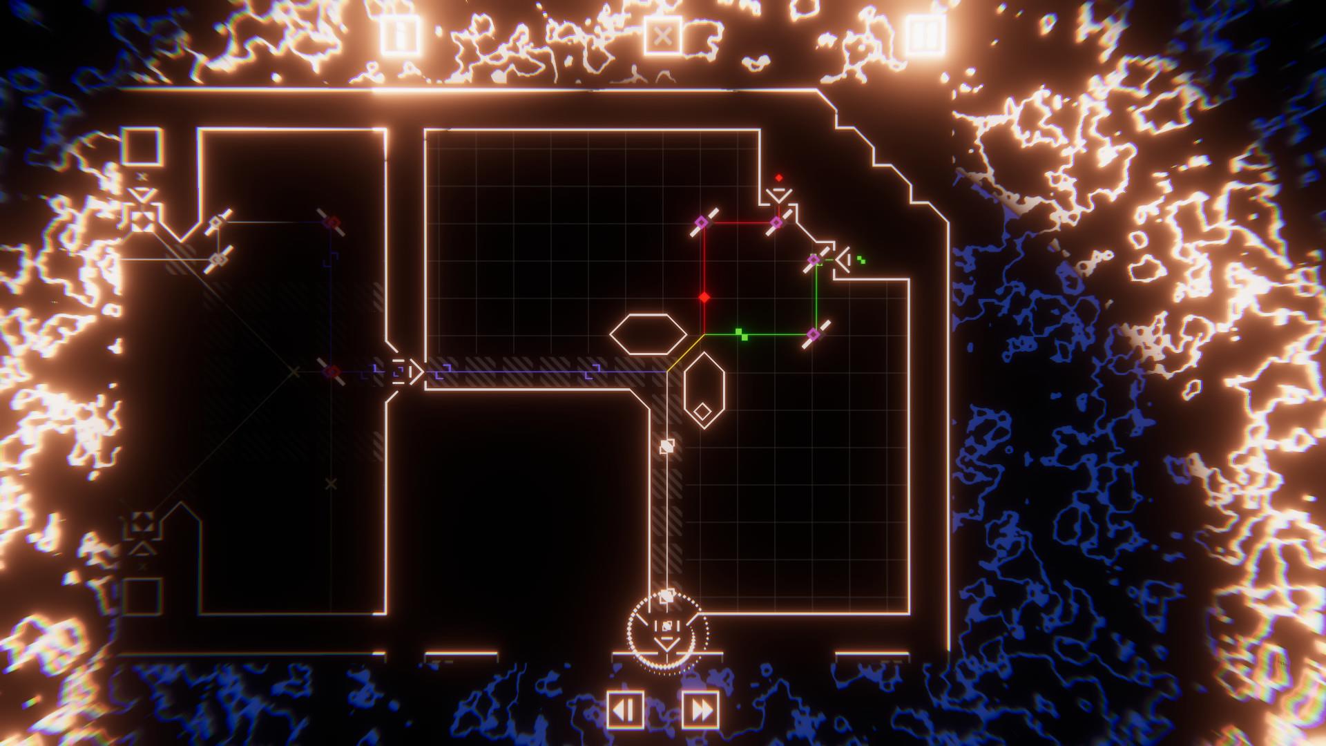
The setup is simple, if a bit vague. You are operating in a giant interwoven machine of panels, with each comprising a level. Moving pulses of colored lights connect the mechanism and power the doors to the next panel. The machine, however, it under attack by an indistinct, infectious invader. The mission is to reconnect the machine, unlocked room by room, and purge the system of the infection. The base pallet is very RGB but as pulse streams merge vibrant purples, yellow, and aquas eventually give way to blinding white. At your disposal are reflector plates to change the direction of the pulses, blocks to construct beams entirely, triggers to open and close gates to allow lights to pass or not, the angle of the pulses themselves, and more. What seems a simple mechanic belies and incredibly complex strategy game that travels forwards, and backwards, through the levels. Sometimes progress is made only to redirect beams found later back to the start and finally unlock another path that was inaccessible without the new light source. Other times paths end in an objective to move back to a previous fork and start a new traverse. The map itself becomes a delightful and permanent piece of the story as the world builds and builds on top of itself.
The core of this game is the puzzles, and the puzzles are done excellently. The game starts off very basic, a few reflector plates and a goal. Eventually the more advanced concepts are introduced, but at a reasonable pace. You learn how to combine beams, separate them back apart, hit triggers, etc. - one technique at a time. Well, "learn" might be a bit generous. Because while the concepts are introduced with a well-paced cadence, you are typically not really taught how to incorporate them into the next challenge in any meaningful way. You basically run into a brick wall and bash your head against it until you finally sort out that there is a new technique required in this room. The game does little to teach you how to play it, but the fact that you are missing a trick is plainly obvious because you cannot advance without finally uncovering that secret by trial and error. The are hints available. A few times per room you can reveal the correct final placement of one of the movable objects. Which object exactly and its orientation is not given, only the location. The hints do not make the solution plainly obvious, but usually are enough to spark that eureka moment, or at least get you off the wrong path before you're too far down that rabbit hole.
But none of that is obvious from the still shots that might be your only peek at the game before you're able to jump in, and that's a shame. The challenge and depth can't be translated to a 2D image, and in that medium the style of the game really isn't doing it many favors. The game looks and sounds so much better in motion. You have to spend a few minutes interacting with it to really appreciate the "synth-inspired visual style" or "synth/chillwave soundtrack." It boils down to audio and visuals that (on the big screen at least) are able to sit with you without distraction while you rack your brain to sort out the next solution. It provides a mood, but not a disturbance; for that I am glad.

Unfortunately, the game does let itself down on the Switch's native LCD. On the big screen, it all comes to life and small visual clues are clearly demarked. On the native LCD, this detail really does get lost in the compressed screen size. Different reflector plates have different abilities: ones with red in their pivot can be rotated, ones with purple can be moved around the screen, red and purple ones can move and rotate. That much is clear. What is often not at all clear is exactly what color a given plate even is when squinting down on the native LCD. Red and purple are just too similar on the color palette to really differentiate when all you have is a few pixels across 6.2 inches of 720p screen. Maybe just using more contrasting colors, red and green for example, would have made all the difference. Another example: there are certain locations that are blocked from placing any movable pieces. These spaces are distinguished by a pattern on the otherwise empty gridlines. However, when there already is a beam of certain types traveling over these background patterns, it again becomes very hard to discern on the native LCD something that is clear and obvious on larger screens. These are Switch problems, Switch players are well versed in; ones PC players have probable never experienced on full screen monitors.
Then there are the controls. You can use a simulated mouse and keyboard system by using the control sticks to slowly amble the cursor around and A/B buttons to simulate the clicks. It's standard ported game stuff, it's lazy, and it almost never makes for a good user experience for the console player. No exception here. Imitating mouse and keyboard with joysticks is just that little irksome experience with Solas as it is everywhere else. Thankfully, it is functional, merely irksome, because we saved by the grace of playing a puzzle game where there is no penalty for moving slowly. It's annoying to move so slowly, but we will be spending much more of our time ruminating on the next move, that furiously spamming moves about. It's just not the smooth gameplay experience that you get with mouse and keyboard, but its functional.

However, A for effort is due the dev team for implementing touchscreen controls, even though the end result is a bit of a mixed bag. While I feel justified in penalizing the game that little bit for not taking the screen size into consideration and not doing much for the mouse and keyboard interface except emulating it, the fact that the devs did ensure touch screen functionality deserves praise. It could use a little fine tuning - I can move and rotate and manipulate my environment decently with the touchscreen, but only decently. There were plenty of instances where the object I wanted to drag just wouldn't pick up without a few attempts, or where I wanted to drop it would want to place itself just off-center from where I was telling my finger to release. So while it's there, it's not nearly as precise as it needs to be to become that effortless experience that would make the difference. Then you also must remember that in order to use the touchscreen I'm also confining myself again to the 6.2 inch LCD. So all those problems with visual clarity come right back to the fore, especially when I finally realize that that piece I just can't seem to pick up and have been blaming touch controls this whole time is actually one of those pieces that is not meant to move and I was instead deceived by that original lack of visual clarity, touchscreen working as intended. Argh!
What we have here is the classic case of porting a game over to the Switch without doing the work to understand and take full advantage of the unique environment we are moving to. It takes an excellent PC game, makes it portable, introduces it to a new user base, but gives them an overall experience that is just that bit poorer than the original. It's a shame, but it does not ruin the outstanding core experience. It's more a missed opportunity. In the end we have a game that I would certainly score higher on PC, but am going to give is a solid rating of merely "good" on the Switch. I recommend Solas 128, but only reservedly on the Switch. If you have the option to play on PC, pick that one up instead, instead you absolutely need the portability.
An excellent puzzler that is let down only by a mediocre port onto a screen that it is doing no favors for. The game plays fine when docked onto a bigger screen, but then the controls let you down that much more when you lose the touchscreen to doodle on. There is a rhythmic, difficult challenge unlocked behind the awkward interface played across a level design that beautifully weaves the very canvas of each problem into the story. I thoroughly enjoyed Solas 128, if only I could shake the feeling I would have loved it more were I playing it on a PC.
Rating: 8 Good
* The product in this article was sent to us by the developer/company.

About Author
First picked up a game controller when my mother bought an Atari 2600 for my brother and I one fateful Christmas.
Now I'm a Software Developer in my day job who is happy to be a part of the Gaming Nexus team so I can have at least a flimsy excuse for my wife as to why I need to get those 15 more minutes of game time in...


