Urban Flow
There are games that simply exist on Switch, and then there are games that were made for the Switch. Games that pop up across platforms and shoehorn themselves into the Switch's hardware and different ways to display, and games that form their very fabric around that hardware and extensibility. Urban Flow lands squarely in the latter. This is a game that takes full advantage of the Switch's unique feature set in the marketplace.
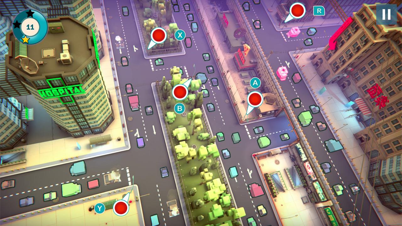
What is Urban Flow? Well, it's a traffic simulator? Ummm...well...basically, you switch lights from green to red and hope nobody dies. You are in control of who goes and who waits among a vast array of vehicles. You've got big trucks ambling slowly, police cars racing past, ambulances on a timer that have to move to save their patients, tanks that stop for no one—red lights be damned—garbage trucks that litter the streets, trains tied to their tracks, and more. What you've got to do is weave together all these vehicles and all their patterns and routes into an orchestra of movement and patience.
Some move by their own rules, like those tanks that won't heed a red light so the path must be cleared ASAP. Some trains or some traffic lanes also have permanent right of way, forcing you to inch the cross-traffic over only in the rare pauses in action, Frogger style. Other times the challenge comes from managing a full load of antsy drivers past bottlenecks where multiple routes merge into a single lane. Force a feeder lane to wait too long and they will eventually take matters into their own hands, run the red, and force ahead anyway. Most of the challenge rests in time management, making sure everyone has a turn in rotation while at the same time balancing the limits that the thoroughfare allows.
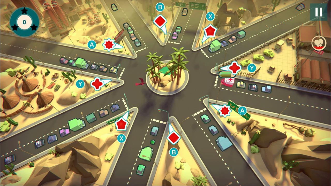
It's actually quite fun, and like all good puzzle games makes you want to chase the three-star rating at the end of each level. You get a few "lives" each map. Basically you can survive a car crash or two without failing, but it will probably prevent you from achieving that perfect score. You also have power ups like a time slowdown button, but I never found a desire to even hit it once. The game is rhythmic and paced well enough that it just felt like cheating and would ruin the appeal for me. But it's there if that kind of thing is your bag. But by far and wide the challenges aren't really such that time slowdown is necessary. It's much more about learning the pattern, following the openings as they arise, then carefully timing a few quick button mashes.
It does all this in a way so native and refreshing on the Switch, mostly because of how it embraces the controls. Lights are mapped both to controller buttons and the touchscreen, so play your way. The touchscreen, I found, was a great way to get started and returned to on certain later levels, but to really get in the groove I found using the controller buttons to be the most effective. It was also faster to use the Joy-Con controls when things get more frantic in more advanced levels. Every light has an indicator and its corresponding button, YXBA, is highlighted there as well. When it works, it's brilliant and intuitive and like a maestro raising his baton.
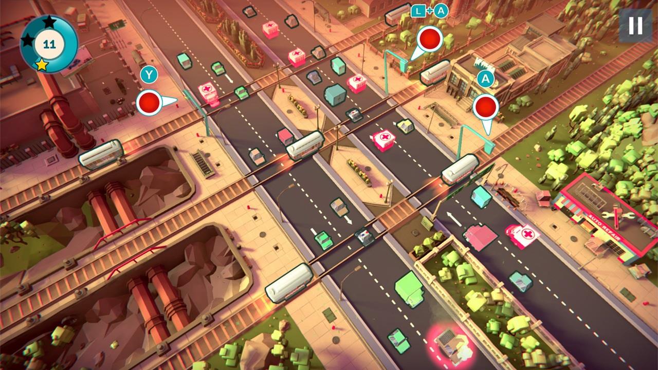
Unfortunately, the first crack in an otherwise great experience shows when, on some maps, the button mapping is just maddeningly obtuse. Those are the rare moments where I either return to the touchscreen or suffer much longer attempts than necessary to finally overcome a challenge presented not by clever level design, but a failure of connecting that design to the input. There are levels where the lights are mapped cardinally to the compass of the YXBA buttons both onscreen as in real life on the Joy-Con itself, and other maps where certain lights stick awkwardly out of place. Sometimes this is unavoidable. If there are more than four lights to manage, then of course you have to go beyond YXBA, but there are enough completely avoidable instances where it is worth demoting the game for it.
There are levels where Y is open yet the shoulder L button employed. Levels where what should naturally be an X or Y control ends up being L+A or B. Please don't. I get what the developers were thinking on some of these occasions: maybe the oddly mapped button is for a different vehicle or lane type, like a train vs. commuter traffic flow. Or a certain pattern is repeated twice in two onscreen areas. You manage one with A & B, the other with L+A and L+B. But having to awkwardly swap back and forth with a shoulder button on the opposite side of entire console is jarring, unnecessary, and awkward. These are the levels where it just doesn't work, and while a shame, are thankfully really few and far between.
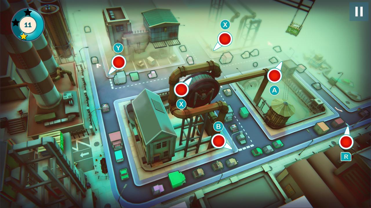
But still, for a game that is so good in its best moments, it's a drag to suffer unnecessarily so. An easy fix: just give the player an option to hot map the lights pre-level and the game would score a full point higher in my review. That would not only avoid this awkward confrontation but even give the player another level of strategy in how they wanted to approach the challenges. Sadly, that's not on offer [but note to devs—please, please read this review and give it some consideration because your game is great, ok thanks bye] yet...
The second crack appears in certain scenarios where your failures just felt cheap. Or others where failures don't feel like failures at all but inexplicable surprises. In the chase for the full three-star rating, you want to avoid any crashes of two merging vehicles, make sure all your ambulances are clearing the screen in a timely manner, etc. However, when you do fail, in many cases there isn't enough onscreen feedback to actually help you learn where you went wrong. There is a lot to manage at any one time. Your attention is being dragged across multiple hotspots at any given moment, and sometimes you see your mistake and brace for impact as a car you just let through gets sideswiped. Ok, learn from it, adjust your patterns, try again.
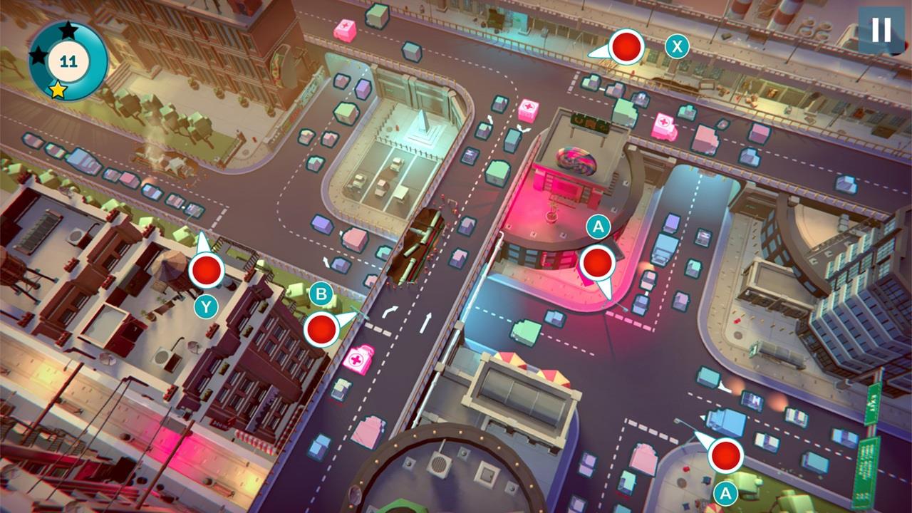
But once you have the basics down and get in the groove, just as many of your failures are going to happen, somewhere...and you won't really know why went wrong. The screen will flash red and you'll be demoted in score but honestly not be able to recognize your error. The reason for this is while the screens does give a little shake and a flash for a moment on a failure, it doesn't really highlight where or why the error occurred. Crashes get a tiny little poof of smoke but then the offending vehicles disappear from the game entirely in a quick fade-out. If your attention wasn't already squarely centered on the problem, it's missed. It's not enough just to get an ambulance past the light, it has to meander all the way off screen in what feels like a distance well beyond the limits of the fixed camera. If that was your error, it is in no way immediately obvious. The second fix the game really needs to consider is better highlighting of the errors entirely. Maybe stop the action for a moment, gray the screen but add a magnifying glass style blow up of the problem area. Maybe add a quick instant replay of the collision or time expiration, whatever. Just give me chance to learn from my mistakes, or even simply recognize my mistakes, not just count them against me and leave me guessing what they even were in the first place.
So there are mystery failures, that's one thing, but there are also other times when your failures feel, frankly, cheap. Cars are meant to run red lights if you leave them too long waiting, that's understood and part of the rules. But there were plenty of occasion where I felt I'd safely swapped a green back to red before the next car had passed the light, but that last oncoming driver paid no heed to my law, blazing past the clear indicator to stop and squarely into the passenger side of the other vehicle with the right of way.

There are other times in certain levels where the screen real estate, or use of it, becomes problematic as well. Runways that always have the right of way leading to an intersection are just too short for certain combinations. Large trucks move slow, small cars faster, police and ambulances faster still. That's all well and good. But on certain levels, in the corner of the screen, if you have a large truck at a full stop, it takes so long to get the beast up to pace that even if there is zero onscreen evidence of an onrushing car—and you let that large truck loose—you are basically playing Russian roulette that a police car or ambulance won't come blazing into view and cause a crash that was really no fault of your own. Again, this is infrequent enough not to ruin the game, but there are certain levels that take way too long to orchestrate to perfection because of these issues. Maybe placing that lane just a little more centrally and you would have a fair onscreen presence to measure your timing of large trucks. But as is, feels like a mistake of design, not of a player.
That said, there is a ton of game here. Two main modes at launch, Campaign and Endless. There are five "tabs" of Campaign puzzles, each with 20+ levels. As you progress in Campaign you open up more maps for Endless play. There are also Challenge maps available via DLC for two bucks more. There are achievements to grab as you play through; a jazzy, relaxed soundtrack that sets the mood; fun, cartoony visuals throughout; plenty of well thought out visual indicators to highlight the various unique challenges, like ambulances, tanks, etc; the sizing is perfect and the game never feels squished, even when paired down to the 6.2 inch native LCD. But it can also be broadcast through the dock for a full display and multiplayer experience for up to four players, everyone grabbing a light and letting the chaos commence.

Urban Flow is a simple enough puzzle game, presented in a unique little traffic management sim package that I can't recall ever seeing before, and offers a ton of engaging interaction with an ever-moving flow of gameplay. It's fun, it has style, and is a great addition to any Switch library to get lost in for a while. There are a few annoyances in some of the control layout and some lack of onscreen indication of your failures that just prevent it from taking that small step into true excellence, but it is a class leading puzzle game nonetheless. Pick it up and you won't want to put it down, suffering from the best form of "just one more level" the Switch has to offer.
Rating: 8.8 Class Leading
* The product in this article was sent to us by the developer/company.

About Author
First picked up a game controller when my mother bought an Atari 2600 for my brother and I one fateful Christmas.
Now I'm a Software Developer in my day job who is happy to be a part of the Gaming Nexus team so I can have at least a flimsy excuse for my wife as to why I need to get those 15 more minutes of game time in...


