The Art of Fallout 4
With as trashed as the Wasteland can appear, there’s an art to its construction. In fact, crafting new-looking things is easy compared to what Fallout’s artists do. Fallout’s artists have to first craft something brand new, then deconstruct it to look either slapdashed together or over 200 years old. The textures are wracked with radiation storms, sunscorched and slipshod, or shot up and ran down.
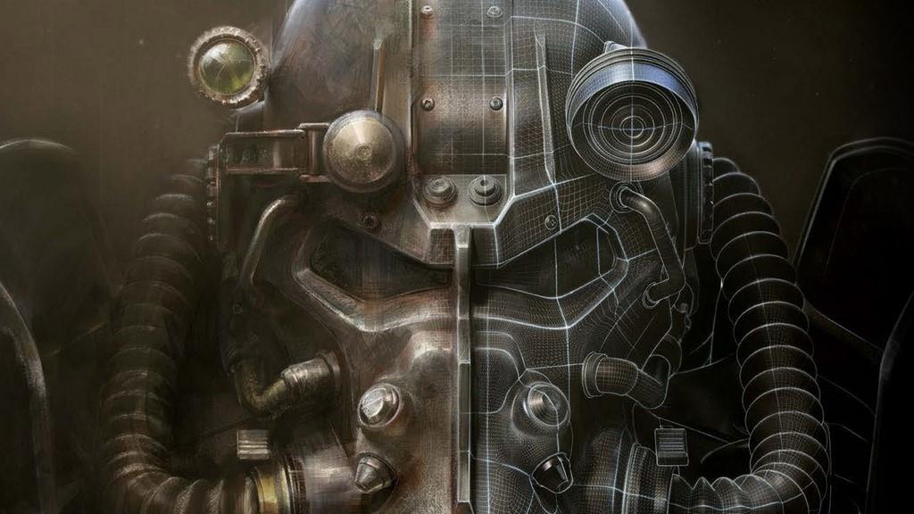
The cover to the Art of Fallout 4 conveys this message in a single image: That of the iconic power armor helmet. The world is hostile in every way imaginable. Everything from Mother Nature to human nature wants you dead. But the fact that you’re willing to step inside that steel monstrosity makes others imminently aware that you do not intend to go down without a fight. You have to lock the world out in order to go out into the world.

The cover also conveys the breadth of tools used in Fallout’s artistry. Half of the power armor is made with brushstrokes. The other half shows the fine grid lines that depict the bumpy surfaces and curvatures making up the power armor’s helmet alone, which only hints at the rest of the suit. It conveys the cleaned-up refinements that go into the crafting of such a hunk of junk-looking suit of armor. Don’t get me wrong, there’s beauty in power armor. But it’s made to be ugly, made to tell the story of the Wasteland, made to depict the junkyard adaptations that man has had to build in order to survive.
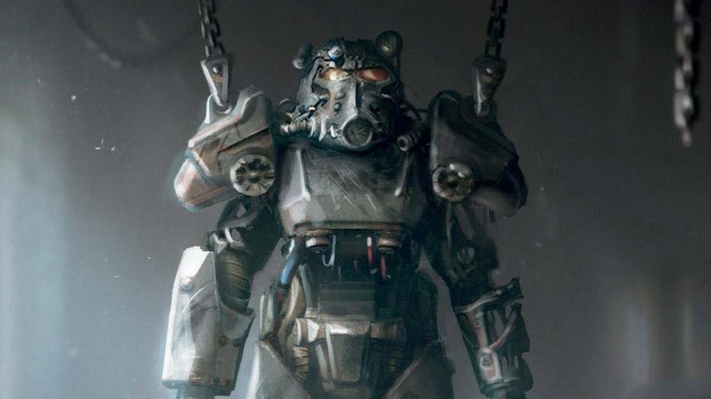
The next piece of art you’re greeted with is none other than an under-construction power armor hung up in a garage with the series’ other iconic character sitting nearby: Dogmeat. The player’s canine companion has been different breeds in different iterations of Fallout, but he’s always, theoretically, been dogmeat. So, with the power armor and Dogmeat painted together, you have man’s two best friends in Fallout 4.
The concept art decorating the table of contents is brilliant. (I swear, I won’t make this a review of each and every piece of art in the book; this thing is 371 pages long.) The table of contents image shows the Starlight Drive-In Theater, one of the many settlements in Fallout 4. A shlocky 1950’s-era horror film plays on the battered movie screen, with “Creature Feature” spelled out with missing letters on the reader board. All the while, a Deathstalker—yet another iconic image from the Fallout universe—paces menacingly at the foot of the screen.

Then there are the concept artists that worked on Fallout 4: Ilya Nazarov, Ray Lederer, and John Gravato. They’re in a panoramic shot that was presumably taken by Lead Artist Istvan Pely (who was not pictured). There’s a separate shot of Adam Adamowicz who passed away in 2012 due to complications of lung cancer. Adamowicz was originally the lead artist in Fallout 4. He was also the only concept artist when Bethesda made Fallout 3. In the photo, Nazarov, Lederer, and Gravato sit in the middle of the art department in a windowless room surrounded by walls filled with concept art. They call it the Art Pit. This is where the magic happens. Though now-Lead Artist Istvan Pely is quick to point out that, while this is an art book, it took teams of people at Bethesda to make the Art of Fallout 4 happen. From the designers giving the work purpose and context, to the programmers ensuring it all works smoothly, to the animators giving it life, to the audio engineers giving it a voice, to the producers who ensure it all comes together smoothly. The Art of Fallout 4 isn’t just a collection of sketches. It’s the making of Fallout 4.
The artists ran with one overriding principles when moving from Fallout 3 to Fallout 4. That was to make everything bigger, more imposing, more realistic, and fully functional. They started with that image on the cover, the power armor helmet. That’s the first thing they drew up. That helmet would form the basis for the rest of the gameworld, essentially, due to its iconic stature in the Fallout series as a whole.
The next piece of artwork they conceived was the vault suit, the blue and yellow coveralls that’ve outfitted every single vault dweller since the series’ beginning in 1997. Along with everything else, the artists wanted to move on from Fallout 3’s heavily controlled and moody color design. The idea was to move the player beyond the despair of surviving an apocalypse in Fallout 3...to rebuilding and looking forward to the future in Fallout 4. Bleak isn’t out, but a dash of hope is certainly in, in the way the manmade elements of the Wasteland pop out from the background.

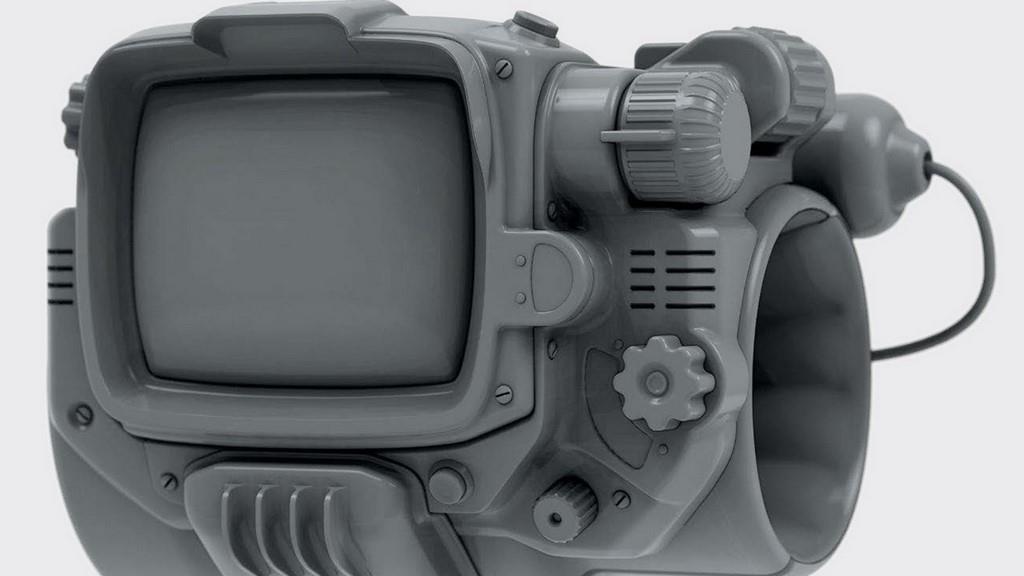
The third item they designed was the Pip-Boy, the forearm-mounted device that talk show comedian Conan O’Brien called “the Microsoft version of the Apple Watch.” Along with the power armor and vault suit, the Pip-Boy forms the third piece of the Fallout holy trinity. Among other small tweaks to the design, Fallout 4’s art team can take credit for putting the knobs on the correct side, i.e., the right side, since the Pip-Boy is worn on the left wrist. Good thinking, guys.
One of the main characters of Fallout 4 comes next: The city of Boston itself. The artists aimed to create a futuristic city, a concept that hadn’t yet been explored in Fallout. But they also wanted Boston’s design to be grounded and relatable. Some of their earliest concepts were pretty far out from the designs they fell back on in the end. And if Fallout 4’s Diamond City reminded you of all the best things Megaton and Rivet City had to offer, well, that’s exactly what the artists intended.
One fascinating set of images depicts some of the early storyboarding in Fallout 4. It’s interesting to see the first brainstormed images of the story, then comparing them to the final product. Baby Shaun wasn’t even in the first depictions of Fallout 4’s pre-bombed introduction. They even describe that your wife in Fallout 4 is pregnant, which vaguely implies that making the player character either male or female was a later development.

The pre-production section of the book even goes back to some of Adam Adamowicz’s earliest sketches. This stuff looks fast and loose, like it was sketched onto a bar napkin and handed over to Director Todd Howard in a fit of alcoholic inspiration. It’s great stuff, especially for would-be artists such as myself, to see such intentionally sketchy artwork put out there for public consumption.
The art team looked at vintage prosthetic limbs when designing the Synths. They looked at my nightmares when building the sentry bot. And they apparently imagined an atomic-punk Wild West when designing pipe weapons. You can even thank the artists for having an airship in the game, since a picture of one inspired its inclusion.
And then there’s the set dressing. You know those pieces of furniture and other household goods you’ve spent hours pushing around the house? Well, the artists spent hours coming up with all that stuff in the first place, naturally. The workbenches, the cooking stations, the cabinets and console panels, all of it.
The book wraps up with the Nuka Cola poster girl, the comic book covers, the safety-first messaging around workplaces, the propaganda messaging, and even the Don’t Feed the Bears signs. (Which is good advice, by the way.) In-game colonial paintings, the wall art you hang up in your shacks, and, of course, the key art pieces that went into Fallout 4’s monster marketing campaign.
Video games are a very visual medium. That goes without saying. But it’s mindblowing to see where a game as lovely as Fallout 4—well, “lovely”—gets its visual footing. Congrats to the Art Pit team. They provided the foundation to a stunning achievement.
Rating: 9 Class Leading
* The product in this article was sent to us by the developer/company.

About Author
Randy gravitates toward anything open world, open ended, and open to interpretation. He prefers strategy over shooting, introspection over action, and stealth and survival over looting and grinding. He's been a gamer since 1982 and writing critically about video games for over 20 years. A few of his favorites are Skyrim, Elite Dangerous, and Red Dead Redemption. He's more recently become our Dungeons & Dragons correspondent. He lives with his wife and daughter in Oregon.
View Profile


